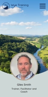
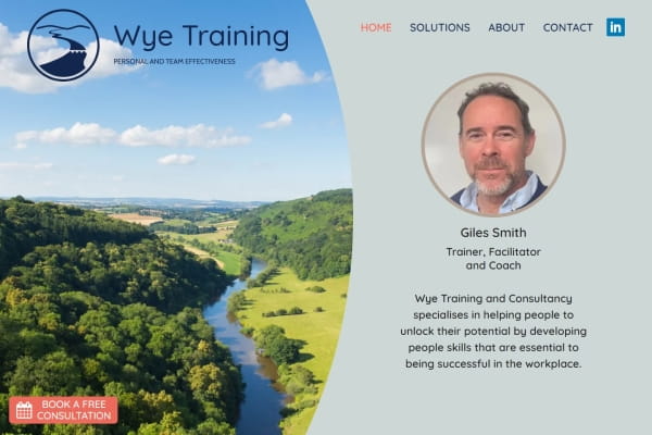
Website and logo for Hereford based training/coaching business
Giles recently set up his training business and needed a website set up.
He already had some branding which we refreshed to make a bit more modern and personal, reflecting his approach to his work. This involved a process of looking at fonts/typefaces, finding a warm yet professional colour palette and incorporating elements of the area around Hereford and Ross-on-Wye into the logo.
For the website I took the new branding and applied it to a very clean, light, yet warm design. Navigation at the top is kept clear, with the homepage incorporating a hero banner with a beautiful photo of the Wye Valley.
The hero banner introduced a fun new challenge for me in the form of image masks. The Wye Valley photo is rectangular but needed to have a rounded edge, which needed to adapt to different screen sizes and orientations.
It was a pleasure to work with Giles on his branding and website, with great results!


Ant has been fantastic to work with on the design and launch of my website. He quickly understood the nature of my business and was able to translate this into a simple and easy to use website with a warm, professional feel. I was consulted at every stage of the process and the everything that Ant did was completed on schedule. I am delighted with the result and I continue to enjoy Ant’s ongoing support.
